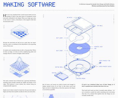
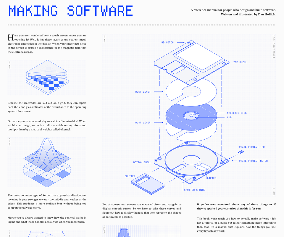
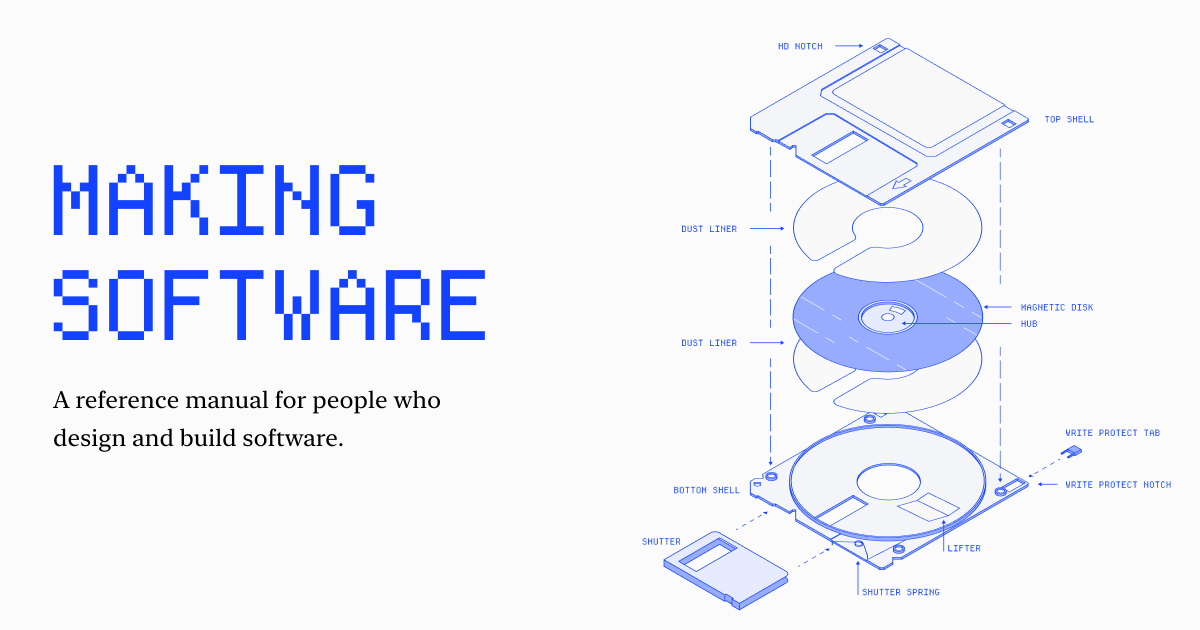
Making Software
A reference manual for people who design and build software. Written and illustrated by Dan Hollick.
A running log of things that didn’t need a full post. Observations, links, minor news.


A reference manual for people who design and build software. Written and illustrated by Dan Hollick.
A beautifully made and well-detailed online book on the components that allow us to make software. It is currently a work in progress with only the first chapter (How does a screen work?) available.
I'm looking forward to how this develops.
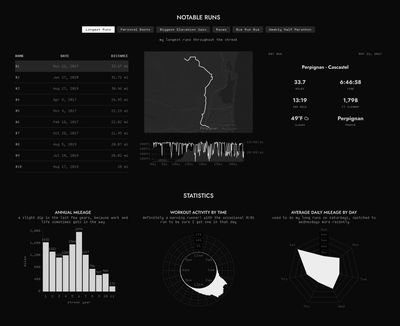
A beautiful and well executed data-visualization dashboard from Adrien Friggeri, in which he logs all the daily runs since July 11, 2015.

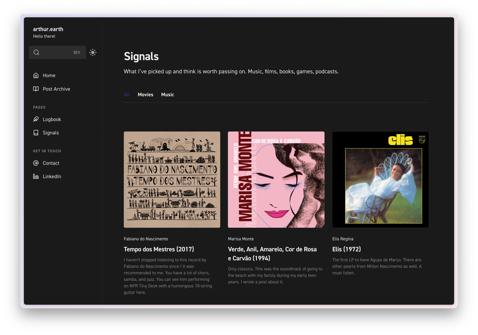
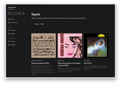
I've introduced another section called Signals. Signals is a running feed of media I think is worth your time: movies, tv shows, albums, books, games, and more. No ratings, very short reviews.
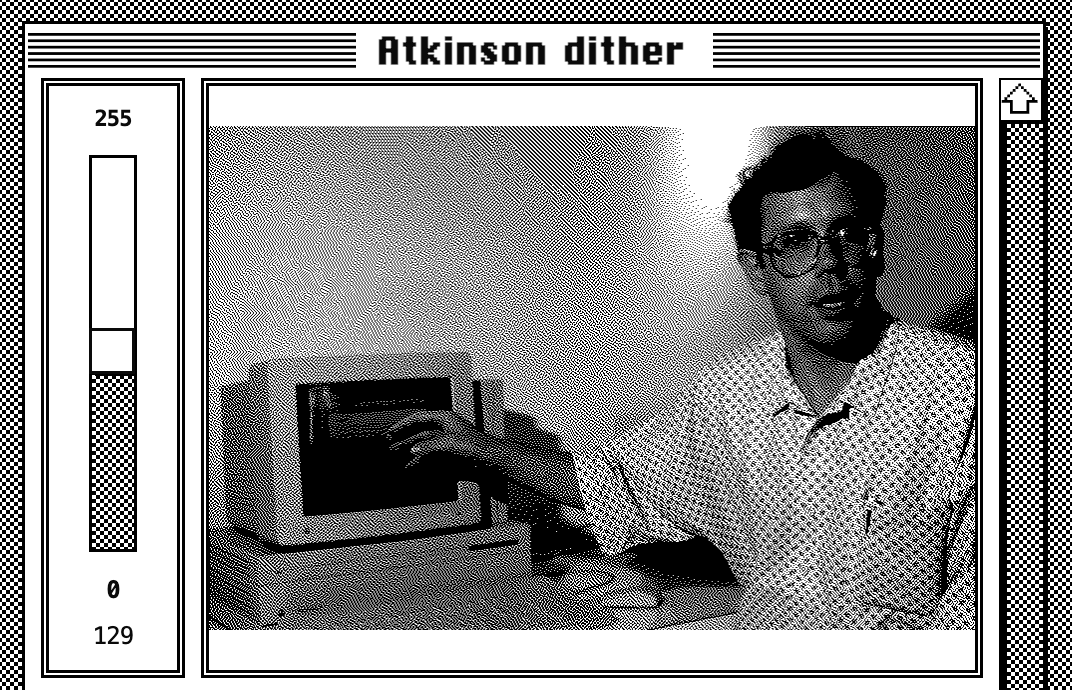
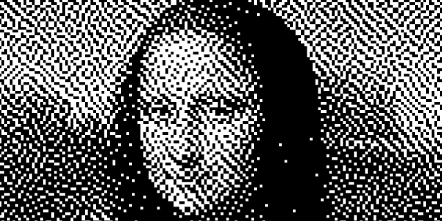
Exploring the beauty of dithering aesthetics, Bill Atkinson's legacy in Mac OS includes the Atkinson Dithering algorithm for MacPaint.

I have previously posted about dithering, which is a beautiful aesthetic that emerged from a technical limitation. Last week, while browsing RSS feeds, I came across the news that Bill Atkinson had passed away. In addition to his numerous accolades in Mac OS and UX design, Bill created his dithering algorithm, known as Atkinson Dithering, which was developed for the original Macintosh (MacPaint). This post serves as a collection of other intriguing resources and articles related to the topic.
Simple HTML App that allows you to drag'n'drop images and create images with Atkinson Dither.

A paid macOS App that allows you to tweak several parameters for image dithering.
A HTML/Javascript element that allows you to create a dithered image on the browser.

An article comparing different Dithering Algorithms.
Figma launched a little site that generates dithered images.
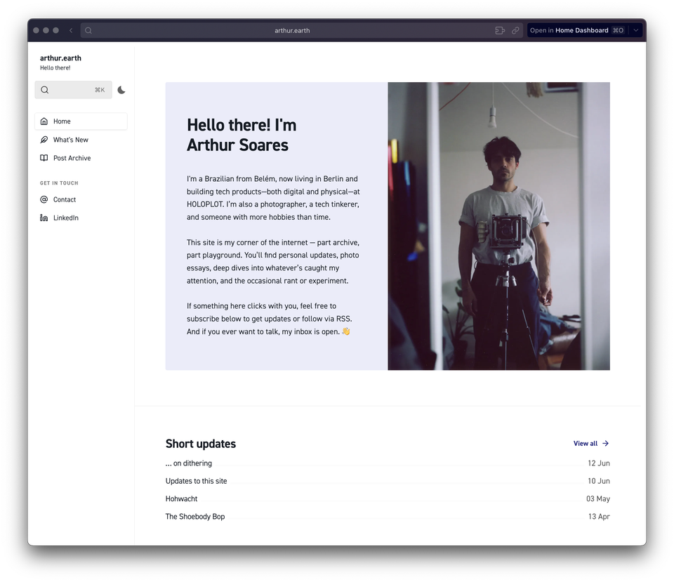
I’ve made some substantial changes to the structure of this site. It still runs on Ghost CMS, but I’ve switched to a more versatile base theme: Braun by Themex. I was drawn to it for the persistent sidebar navigation and the clever workarounds it uses to overcome Ghost’s limitations.
The theme is designed so I can build pages and specific types of collections with distinct layouts using internal tags. For example, the "What’s New" section is just regular posts filtered by a tag. Simple, but it works well.
The plan is to split the content into a few areas:
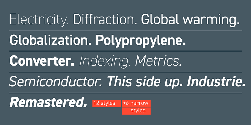
I'm sure – and hope – you've noticed the beautiful typography. I'm making use of my recurring Adobe subscription and utilizing two gorgeous fonts for the website, they are:
Enjoy!
The Shoebody Bop is weird, handmade, and pointless in the best way. No polish. No plan. Just someone making stuff for fun. It reminds me why I liked the internet in the first place.
Lately, everything online looks the same. Instagram, TikTok, YouTube—it’s all polished, pasteurized, and predictable. Same music. Same lighting. Same pacing. Even the “authentic” stuff feels rehearsed. And now there’s AI, everywhere. Sometimes it spits out something clever. Mostly, it just adds to the noise.
Perhaps the only great use for GPT4o
But beneath all that, the weird stuff still exists. Every now and then, I see flashes of the old internet. You never knew what you’d find. Handmade websites and webrings in Geocities. Broken animations. Obsessive YouTube channels with 17 views. The kind of strange that makes you stop scrolling.
I hope more of that comes back. People making things just because they feel like it. No brand, no strategy—just odd little projects that serve no real purpose. It’s messy. In that spirit, I’ve been on a binge on some weird animations from The Minute Hour and other sources.
Jarrad's Multiverse
The Dogs that are my friends
The Shoebody Bop
That's a nice grill
Here we are in 2025 and I'm slowly dawning into the reality of being back in Berlin. Over Christmas and New Years, I traveled between Belém and São Paulo with Hannah and her family. It was the first time with Hannah and Brazil, and the first time that both of our families were together in full cast.
I got to eat my fair share of Tacacá, Tapioca, Filhote, and Farofa; I learned how to climb an Açaí tree with a Peconha; I had Caranguejo Toc-toc at Atalaia beach; I danced Forró with my 101 year old Grandmother; I was amazed with all the beautiful African textiles at Pinacoteca do Estado; I spent Christmas and New Years in the best possible company; Did I also mention that we got engaged? 💍
… but this post is not about that trip, as it will get it is own space. Here is another list of interesting tidbits from the last days and weeks.
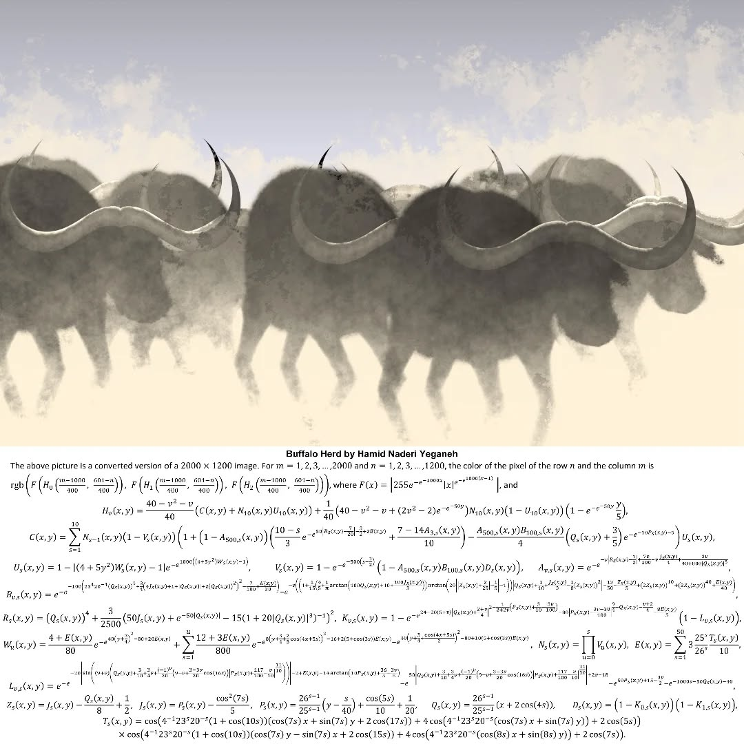
Hamid Naderi Yeganeh, a research student at UCL Maths, creates images using only mathematical formulas.
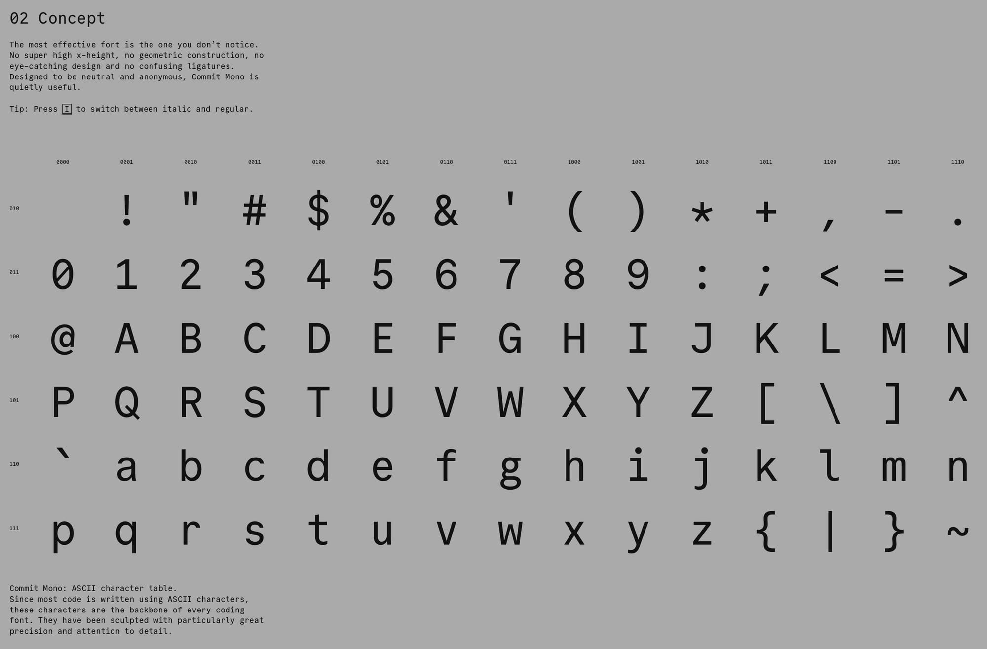
Commit Mono is an anonymous and neutral coding font focused on creating a better reading experience. I try to unify my Font Family choice among different writing/reading interfaces (Terminal, Obsidian, VSCode, and Kindle), and this is a beautiful –and fairly similar– replacement to my previous favorite: Meslo LG. The website does a great job in demoing its perks.
InkPoster, developed by PocketBook, was one of the very few things that excited me at CES. It is a Picture Frame + ePaper Screen + App that, well, displays images using ePaper.
The resolution seem to be fairly large (2160x3060px) for the estimated circle of confusion for such pieces. It employs the recent E Ink's Spectra 6 displays. This seems to be on a different level than E Ink's Kaleido displays; the ones used on Kindle Color.
That is super niche, and expensive product, but it is one that I'm interested in seeing more of.
Dandadan: This was recommended to me by Rabih, and without a doubt is one of my recent TV highlights. I will not spoil the fun; just go ahead and watch the intro.
👋