Quick thoughts, links I want to remember, and site updates. The rougher, more frequent side of the site. Think of it as the notebook next to the essays.
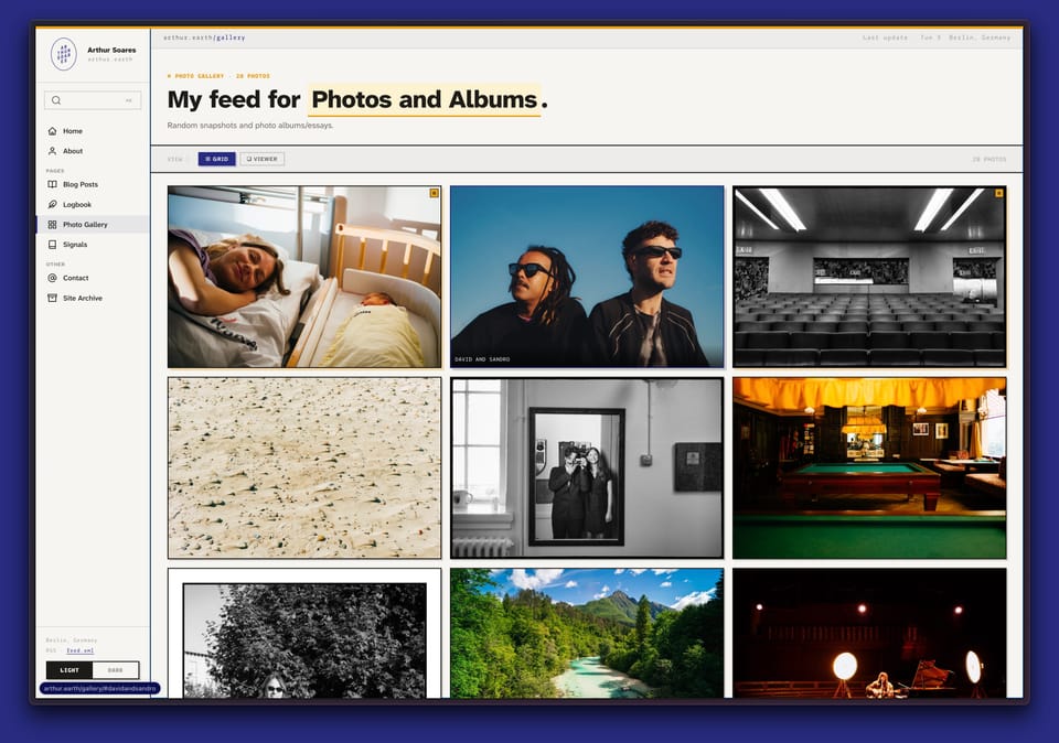
I finally gave my photos and albums a proper home on the site
I had been meaning to do this for a while, and parental leave gave me just enough space to clean up the site and move some things around. The new section is now in the sidebar and on the homepage, with photos shown as a grid and opened in a simpler viewer. I also enabled comments for logged-in users, which makes the site feel a little less like a static archive and a bit more like a place again.
The goal is mostly to have a place that feels mine, away from Instagram and the usual platform churn. I uploaded the main 2025 albums already, including ISE, Sicily, and Ada’s birth, plus a few older ones from Belém. I’ll probably add to it more often, but without turning every update into an email. The normal newsletter cadence remains intact: almost never.
A small batch of design-system-for-agents bookmarks. Mostly attempts to make visual judgment portable enough that a coding agent can do something useful with it.
Four bookmarks around the same question: how much visual taste can you package up and hand to a coding agent?
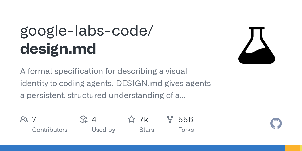
design.md
The most literal version — a proposed DESIGN.md format from Google Labs for describing a visual identity to coding agents. I like the bluntness of this: not another component framework, just a structured file that says “this is what the thing should feel like” before the agent starts spraying Tailwind around.
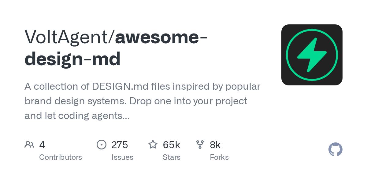
Takes the same idea and turns it into a library shelf — a collection of DESIGN.md files reverse-shaped from known websites. The useful part is not really imitation, but calibration: giving an agent enough visual reference material that it stops treating “make it nice” as permission to invent startup gradients.
The messier cousin of the same impulse — a skill that tries to package design intelligence for AI-assisted UI work. It has the slightly overstuffed energy these things often have, but it points at the same gap: coding agents are now good enough at implementation that the bottleneck moves upstream into taste, hierarchy, spacing, and knowing when not to add another card.
Sits slightly off to the side, but belongs in the same folder — an experiment from Cheng Lou around text, structure, and interface generation. Compared with the more explicit agent-design files above, this feels less like “give the model a brand guide” and more like “change the substrate the interface is made from.”
A handful of creative coding tools I bumped into over the last two weeks.
Shaders
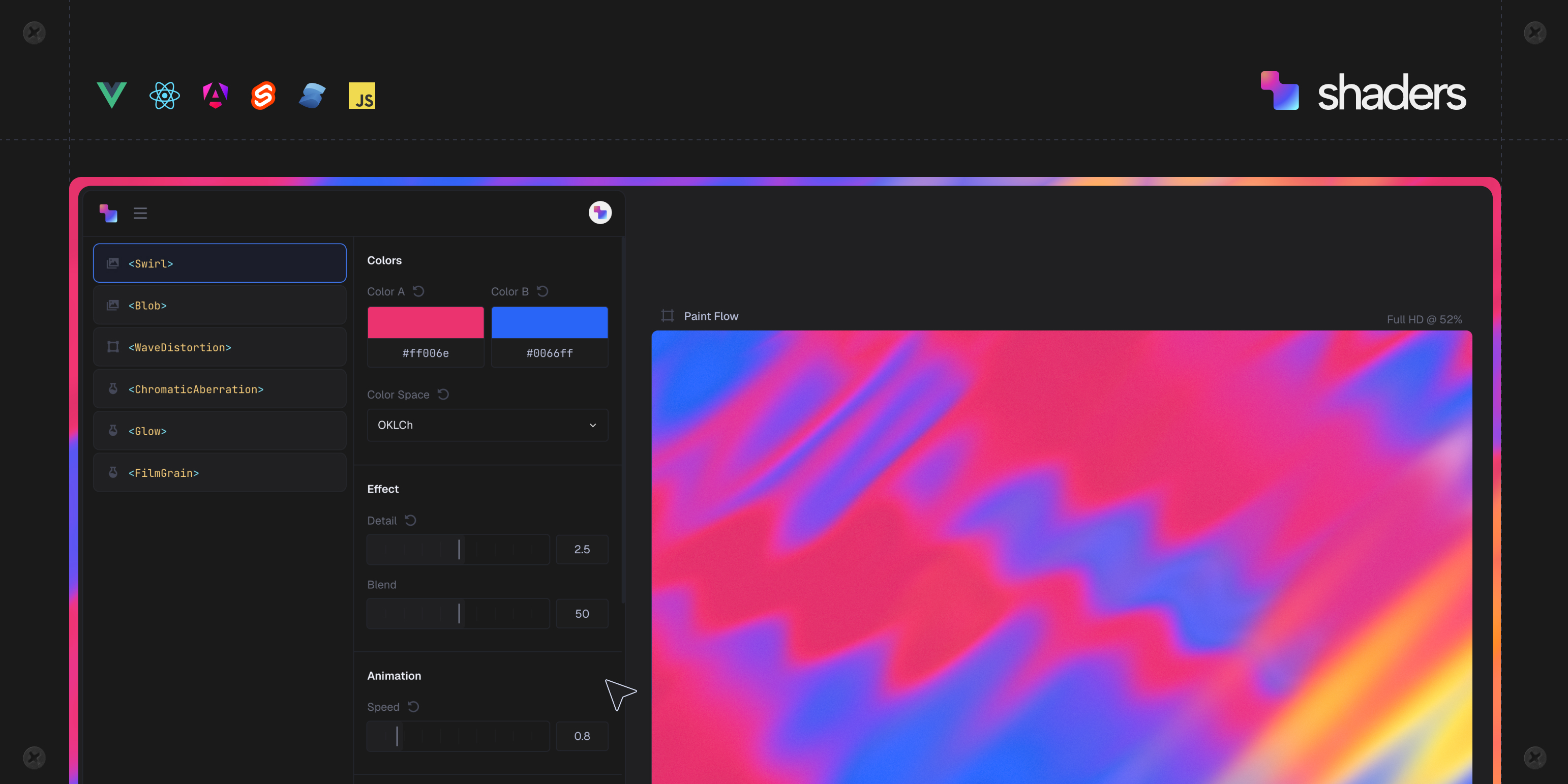
A component library for creative WebGPU effects in modern frontend frameworks — Vue, React, Svelte, Solid, plain JS. Each component is interactive and composable. You bookmark it knowing the right project will eventually show up.
A powerful toolkit to create, stack, and animate shaders from basement.studio. More playground than library — you open it to test an idea and emerge an hour later with something you didn't plan.
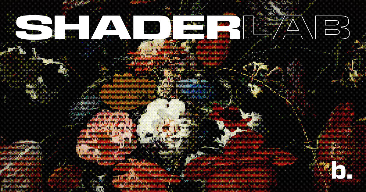
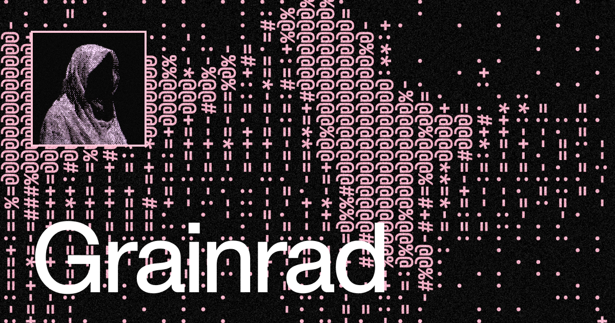
WebGPU-powered ASCII, dithering, and retro effects at 60fps. The controls let you degrade fidelity precisely — halftone patterns, character maps, scanlines. It's a specific aesthetic and it knows exactly what it is.
A barcode generator that cares about aesthetics. Transform data into scannable SVG artwork. A narrow tool, clearly built by someone who found the existing options insulting.
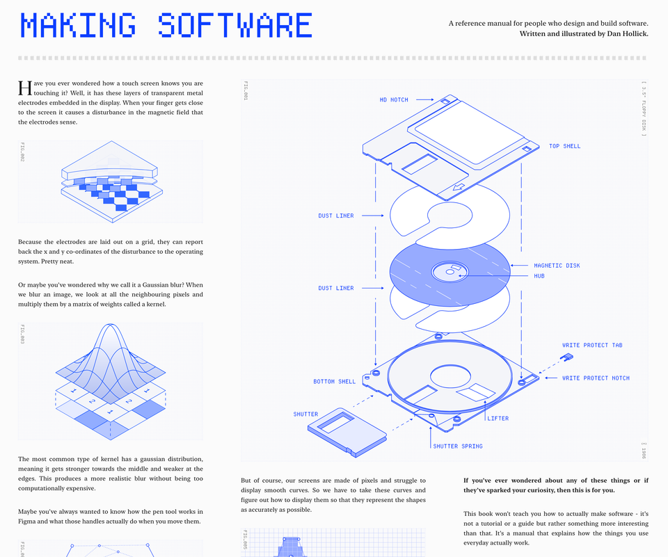
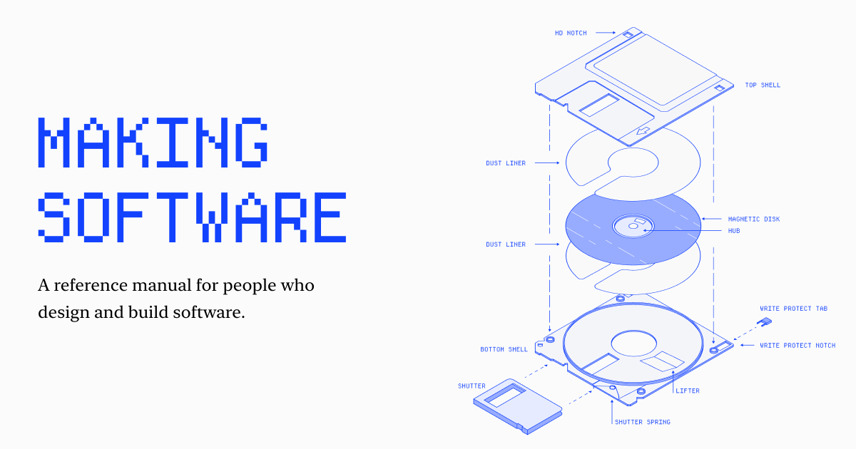
A reference manual for people who design and build software. Written and illustrated by Dan Hollick.
A beautifully made and well-detailed online book on the components that allow us to make software. It is currently a work in progress with only the first chapter (How does a screen work?) available.
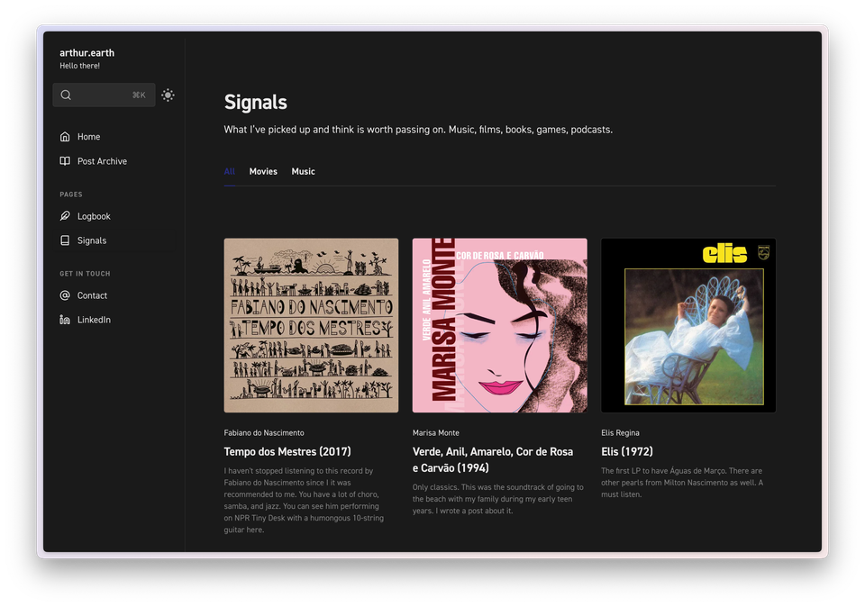
I've introduced another section called Signals. Signals is a running feed of media I think is worth your time: movies, tv shows, albums, books, games, and more. No ratings, very short reviews.
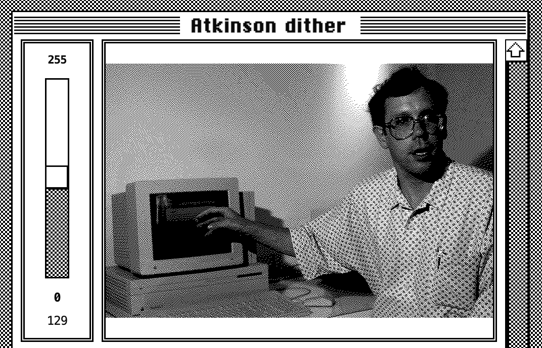
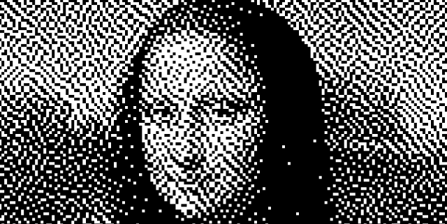
Exploring the beauty of dithering aesthetics, Bill Atkinson's legacy in Mac OS includes the Atkinson Dithering algorithm for MacPaint.
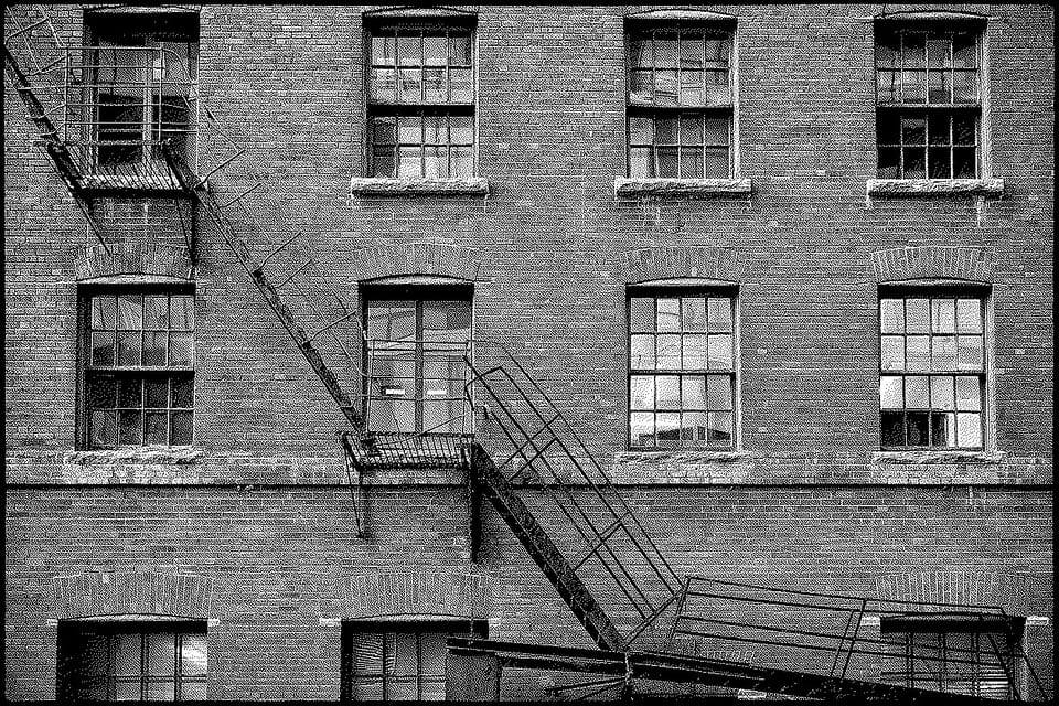
I have previously posted about dithering, which is a beautiful aesthetic that emerged from a technical limitation. Last week, while browsing RSS feeds, I came across the news that Bill Atkinson had passed away. In addition to his numerous accolades in Mac OS and UX design, Bill created his dithering algorithm, known as Atkinson Dithering, which was developed for the original Macintosh (MacPaint). This post serves as a collection of other intriguing resources and articles related to the topic.
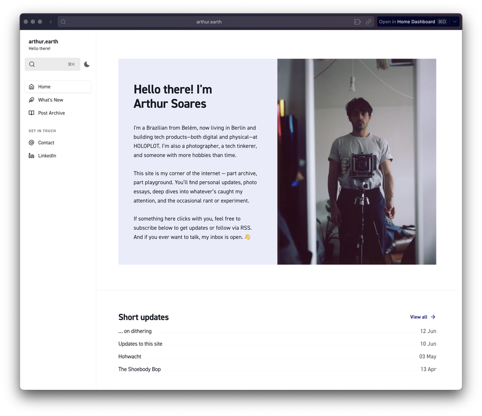
I’ve made some substantial changes to the structure of this site. It still runs on Ghost CMS, but I’ve switched to a more versatile base theme: Braun by Themex. I was drawn to it for the persistent sidebar navigation and the clever workarounds it uses to overcome Ghost’s limitations.
The theme is designed so I can build pages and specific types of collections with distinct layouts using internal tags. For example, the "What’s New" section is just regular posts filtered by a tag. Simple, but it works well.
The plan is to split the content into a few areas:
Newsletter (email only): Personal updates and broadcasts to friends
Posts (sometimes emailed): Longer-form content
What’s New (not emailed, name still TBD): A stream of shorter, feed-like posts
Recommendations (not emailed): Curated lists of media, tools, apps, etc.
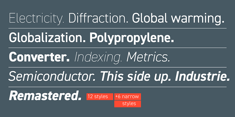
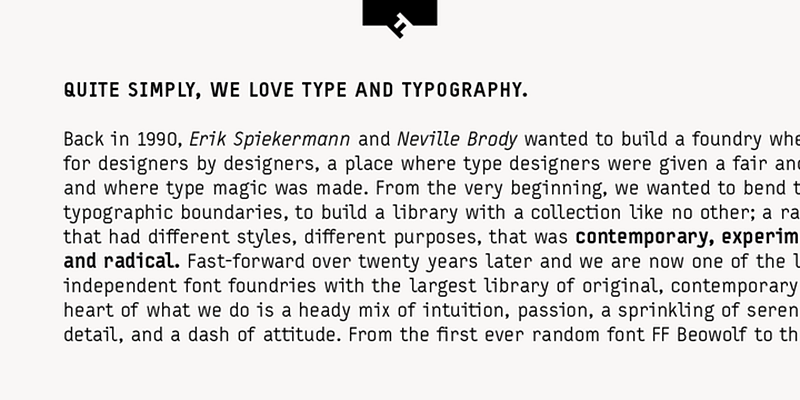
Typography
I'm sure – and hope – you've noticed the beautiful typography. I'm making use of my recurring Adobe subscription and utilizing two gorgeous fonts for the website, they are:
The Shoebody Bop is weird, handmade, and pointless in the best way. No polish. No plan. Just someone making stuff for fun. It reminds me why I liked the internet in the first place.
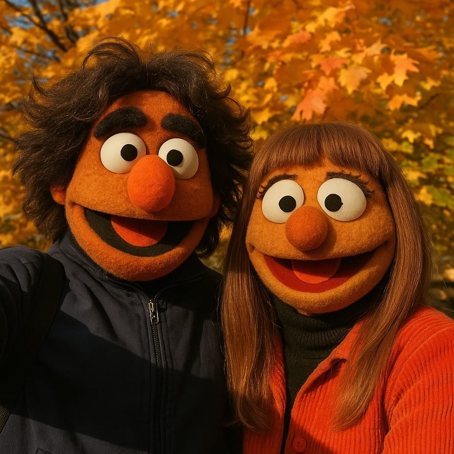
Lately, everything online looks the same. Instagram, TikTok, YouTube—it’s all polished, pasteurized, and predictable. Same music. Same lighting. Same pacing. Even the “authentic” stuff feels rehearsed. And now there’s AI, everywhere. Sometimes it spits out something clever. Mostly, it just adds to the noise.
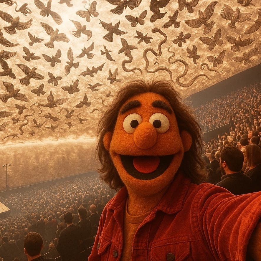
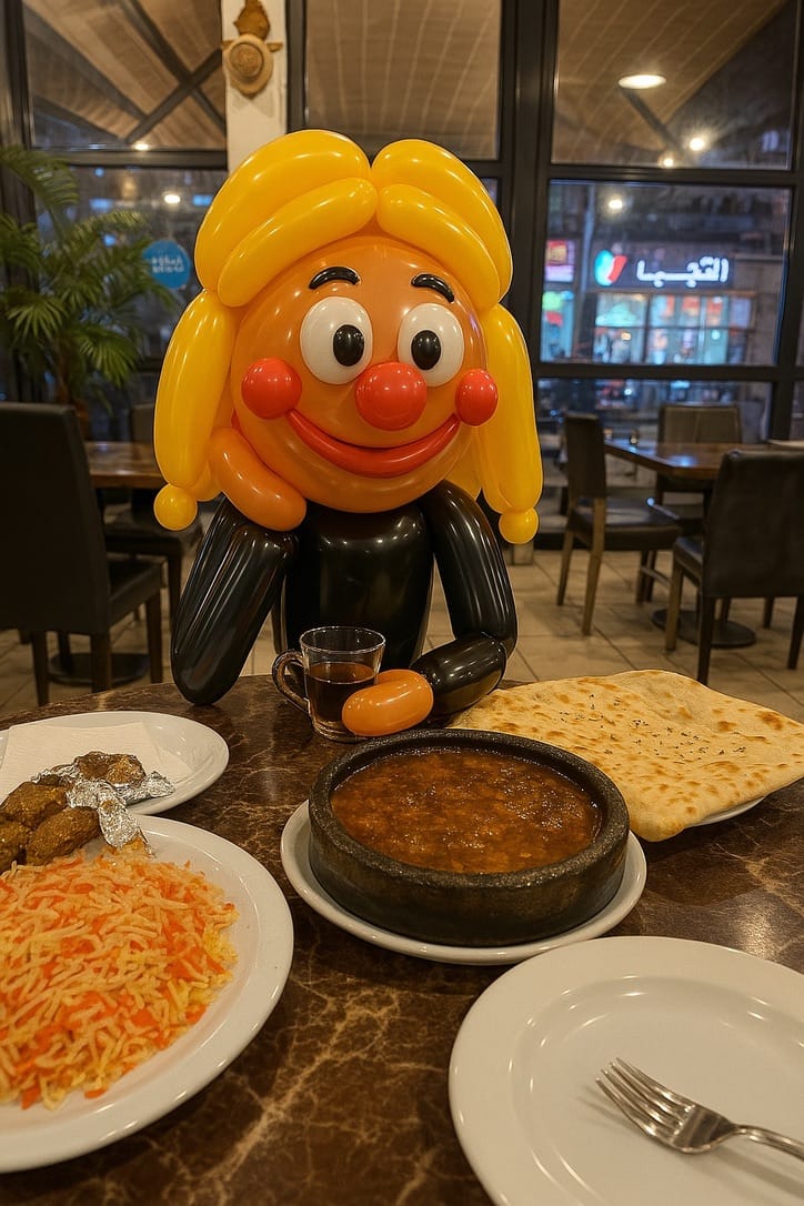
Perhaps the only great use for GPT4o
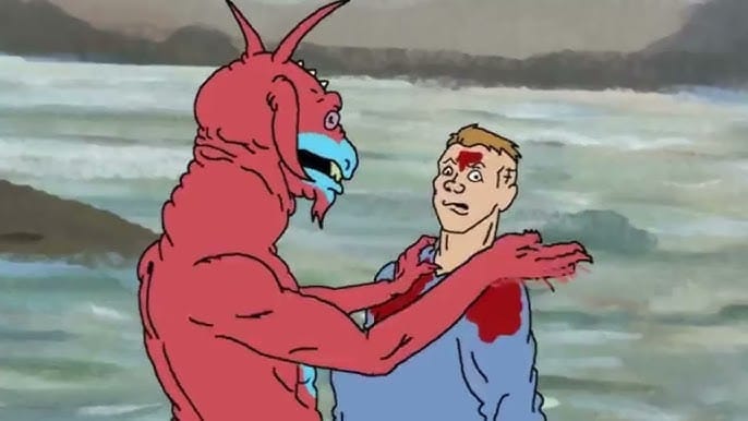
But beneath all that, the weird stuff still exists. Every now and then, I see flashes of the old internet. You never knew what you’d find. Handmade websites and webrings in Geocities. Broken animations. Obsessive YouTube channels with 17 views. The kind of strange that makes you stop scrolling.
I hope more of that comes back. People making things just because they feel like it. No brand, no strategy—just odd little projects that serve no real purpose. It’s messy. In that spirit, I’ve been on a binge on some weird animations from The Minute Hour and other sources.
Here we are in 2025 and I'm slowly dawning into the reality of being back in Berlin. Over Christmas and New Years, I traveled between Belém and São Paulo with Hannah and her family. It was the first time with Hannah and Brazil, and the first time that both of our families were together in full cast.
I got to eat my fair share of Tacacá, Tapioca, Filhote, and Farofa; I learned how to climb an Açaí tree with a Peconha; I had Caranguejo Toc-toc at Atalaia beach; I danced Forró with my 101 year old Grandmother; I was amazed with all the beautiful African textiles at Pinacoteca do Estado; I spent Christmas and New Years in the best possible company; Did I also mention that we got engaged? 💍
… but this post is not about that trip, as it will get it is own space. Here is another list of interesting tidbits from the last days and weeks.
1.
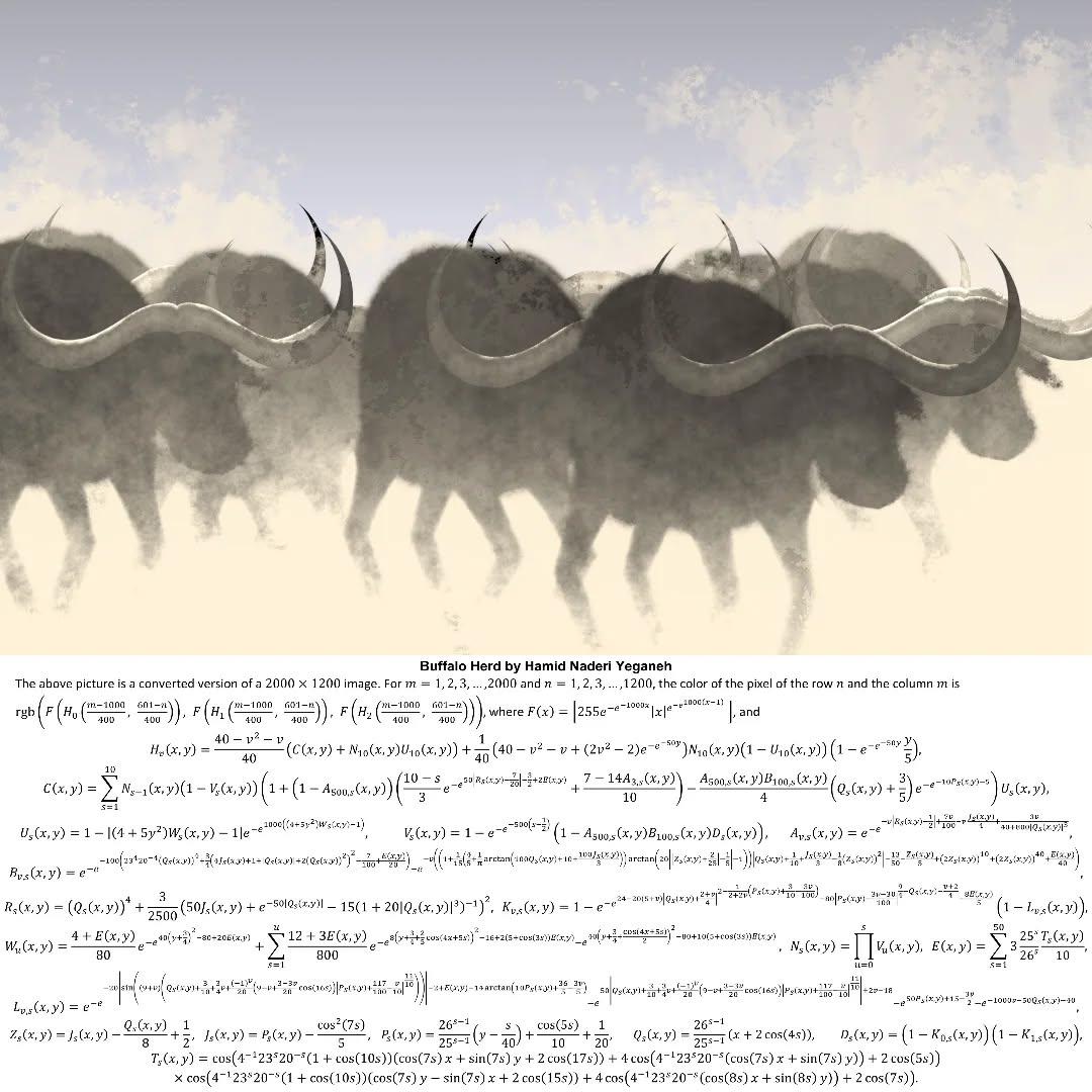
Hamid Naderi Yeganeh; Images created by Math
Hamid Naderi Yeganeh, a research student at UCL Maths, creates images using only mathematical formulas.
2.
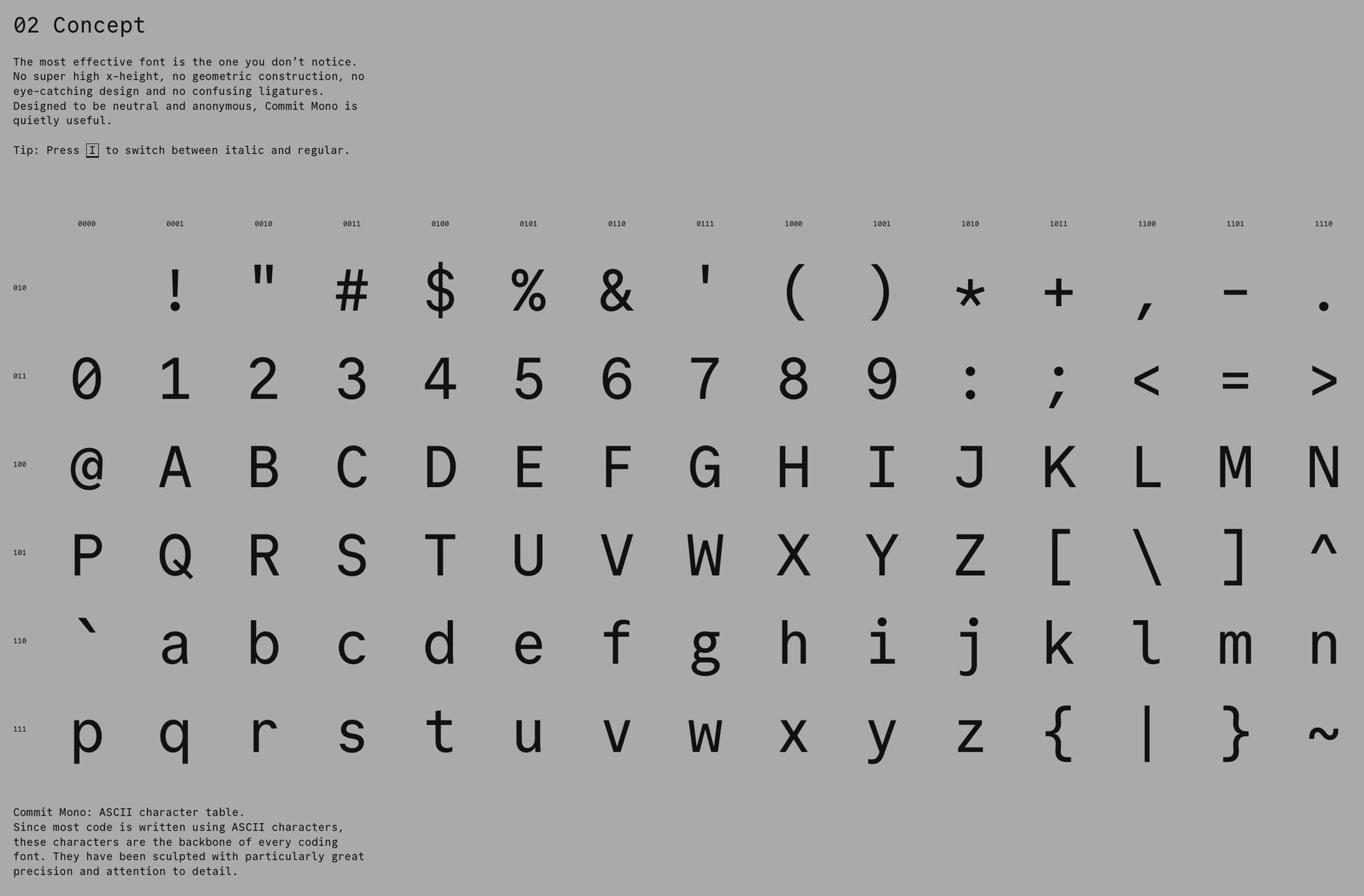
Commit Mono
Commit Mono is an anonymous and neutral coding font focused on creating a better reading experience. I try to unify my Font Family choice among different writing/reading interfaces (Terminal, Obsidian, VSCode, and Kindle), and this is a beautiful –and fairly similar– replacement to my previous favorite: Meslo LG. The website does a great job in demoing its perks.
3.
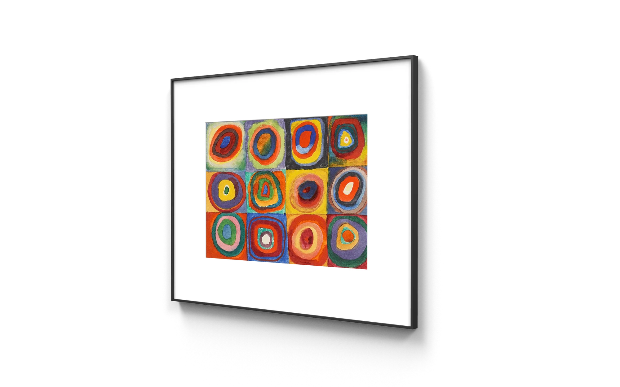
InkPoster: Art on ePaper
InkPoster, developed by PocketBook, was one of the very few things that excited me at CES. It is a Picture Frame + ePaper Screen + App that, well, displays images using ePaper.
The resolution seem to be fairly large (2160x3060px) for the estimated circle of confusion for such pieces. It employs the recent E Ink's Spectra 6 displays. This seems to be on a different level than E Ink's Kaleido displays; the ones used on Kindle Color.
That is super niche, and expensive product, but it is one that I'm interested in seeing more of.
4.
Dandadan: This was recommended to me by Rabih, and without a doubt is one of my recent TV highlights. I will not spoil the fun; just go ahead and watch the intro.
Some of the most interesting projects come from working in isolation, without chasing popularity. Games like MyHouse.WAD, Notpron, and Universal Paperclips grew beyond their creators' expectations, showing how passion projects can unexpectedly gain attention.
Some of the most interesting projects are those created in a vacuum, where ideas can be explored freely without the pressure of outside influence or the expectation of success. I was reminded of this recently when I stumbled upon a video about MyHouse.WAD, a Doom mod that unexpectedly blew up online. These projects often start small, shared quietly within niche communities, but the dedication and creativity behind them can lead to much greater attention than ever anticipated.
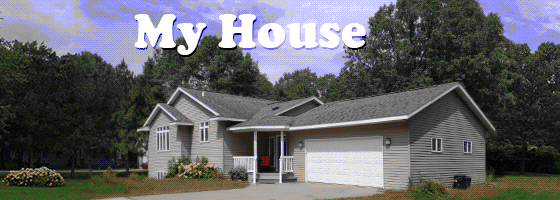
For example, MyHouse.WAD started as a personal project by user Veddge, who updated an old Doom map found on a floppy disk belonging to a late friend. Originally shared in a low-key post on Doom World's forum, the project grew in scope and ended up receiving far more attention than expected due to the care and detail put into it. However, the story behind MyHouse.WAD might not even be real—it could simply be lore created to give context to the game, adding another layer of intrigue.
Walkthrough of MyHouse.WAD
This idea of working in isolation, without chasing popularity or external approval, reminds me of Notpron, an online puzzle game created by David Münnich in 2004. This game really blew up among friends of mine around that time. It started as a simple concept: each screen presents a web page with hints, and the goal is to figure out how to advance to the next level. What began as a niche puzzle grew into a widely recognized and challenging riddle on the internet.
Another example is Universal Paperclips, a game by Frank Lantz where you play as an AI that makes paperclips. What begins with clicking a button to create a single paperclip evolves into a complex system of automation and growth. The game’s growth slows down at points, and you have to invest reurces like money, materials, or computing power to discover new technologies and keep expanding. The game ends when the AI converts all the matter in the universe into paperclips.
These projects show that when ideas are allowed to grow without external pressure or expectations, they can turn into something much bigger than originally intended. Sometimes, it's this freedom that helps them find their audience. Do you know of any other projects that started small but grew beyond expectations?
 Dwarkesh Patel